Showing posts with label joywilsonink. Show all posts

Thursday, August 24, 2023

Thanks, You Are My Sunshine Thank You Card

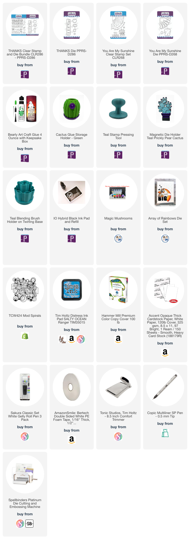
Hello Prickley Pear friends!  Joy, here with you today sharing a bright and cheerful thank you card.  I hope this inspires you to make something fun too.  Recently I received a card in the mail thanking me for something really small that I did for friend and it meant the world to me. I think we have forgotten how special it feels to get happy mail instead the regular daily business of the grind. I for one, am guilty of not making enough "Thank you" cards, but I'm going to change that. My card uses the new Thanks stamp and coordinating die from Prickley Pear Stamps. Let me know what you think.


You Are My Sunshine


I love the new bold look of the Thanks stamp and die because it takes up a large portion of an A2 card panel. Not only does this come with the stitched font, but two others and twelve complimentary images. Wowzers! That's fantastic!!! I decided to color the word in a gradient of grays using Copics so that it would stand out further on this bright card. I think the You Are My Sunshine stamp was perfect to create this rainbow sky. I cut this out using a coordinating die and popped it up on the stenciled background.

What's really cool is that to create this background you can use any stencil from your stash and pounce a blue ink through it. I used a rainbow die from my stash which I cut out in white and colored it with Copics. You could definitely used 1/4 inch strips of colored cardstock to create a similar look. Finally I added a few clear dew drops and a single red heart.

Well, friends, I hope you’re feeling inspired from this post! Tag me on Instagram if you make a project using this as inspiration!! I’d love to see how you made it your own!! Xx, Joy


For more Prickley Pear Stamps inspiration check these out:
Shop
Instagram
Prickley Pear Pals Facebook Page
Prickley Pear Stamps Blog
Pinterest



You can connect with me here:
IG @joywilsonink
Pinterest
Youtube


Bye for now!!! 

Thursday, August 17, 2023

Doggone Good Friend Handmade Card

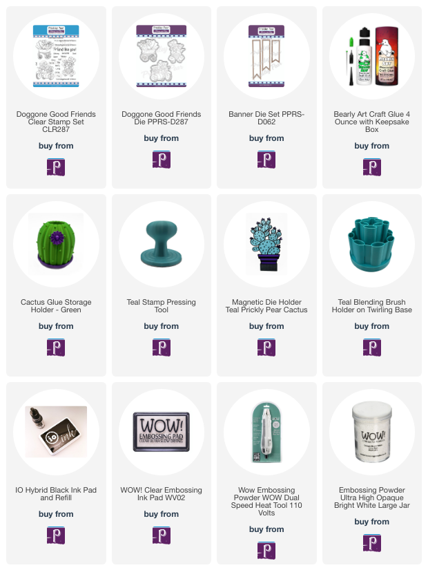
Hello to all my Prickley Pear Pals!  I hope you're having a fantastic day!  Joy, here and I sharing a fun friendship card using the Doggone Good Friend stamp set and coordinating die.  I think it's always good to tell those you care about that you're thinking of them don't you? Well with this stamp set you get three amazing images and get this, eighteen sentiments to build just the right greeting for your phone. I also like that the stamp is diverse and can be used for any occasion if you change up the sentiment. One of my favorite images is the one with two dogs in a carriage. Wouldn't that be great for a baby shower? So many possibilities with this set!!!


Prickley Pear Stamps


I chose the cute motorcycle with side car stamp that is included in the Doggone Good Friends set and colored it with Copics and then cut it out using the coordinating die. Next I stenciled the flames using Distress Oxides in the colors Mustard Seed and Crackling Campfire onto black cardstock. Once the inks were dry I embossed the top sentiment directly onto the panel using Wow Embossing Ink and white embossing powder. I thought it would be fun to emboss the bottom sentiment onto a Banner die too.

Tip: apply clear embossing powder over the card panel that was inked with Distress Oxides to make sure it is dry. You will know because the powder will stick. Be sure to brush off the powder and dry the ink with a heat tool before embossing your sentiment.

To finish off my card I popped up the elements onto foam tape and then added yellow confetti bling. I think it turned out super cute. Let me know what you think...


For more Prickley Pear Stamps inspiration check these out:
Shop
Instagram
Prickley Pear Pals Facebook Page
Prickley Pear Stamps Blog
Pinterest


You can connect with me here:
IG @joywilsonink
Pinterest
Youtube

Bye for now!!! 

Tuesday, June 6, 2023

How To Create a Bold Clean and Simple Design with Mini Butterflies

Hello pals!  It's Joy here with you today and I'm going to talk about how to create a bold, but clean and simple design using the Mini Butterflies stamp set.  I think at times we think of clean and simple as being a lot of white space and not a lot going on, but why not add punches of colors to keep the eye engaged?  


I like to use the rule of thirds similar to photography. The theory is to have intersecting grids that correspond both vertically and horizontally.  In photography you typically choose if the horizon is going to be in the top 2/3 or bottom thirds.  In this card I chose the pink splash to be my "horizon"  leaving the bottom one third empty.   

To create this card I blended Distress Oxides through a Paint Splatter stencil in the colors Picked Raspberry, Squeezed Lemonade and Mermaid Lagoon.  You could use any splash or linear stencil to obtain this same look.  

After the stenciling was complete I then stamped three of the Mini Butterflies onto the splashes of colors making sure to have a portion of each one hanging off into the white space. This add a lot of interest without having to apply "more". To finish of my card I added matching enamel dots and stamped the beautiful sentiment that quotes Ralph Waldo Emerson.

Well, friends, I hope you’re feeling inspired from this post! Tag me on Instagram if you make a project using this as inspiration!! I’d love to see how you made it your own!! Xx, Joy

For more Prickley Pear Stamps inspiration check these out:

Shop
Instagram
Prickley Pear Pals Facebook Page
Prickley Pear Stamps Blog
Pinterest


You can connect with me here:
IG @joywilsonink
Pinterest
Youtube

Until next time keep crafting!!!


Sunday, May 28, 2023

Slay the Day, But First Tea

Hello Prickley Pear Pals!  Joy here today sharing a bold Tea inspired card.  It's no secret that I have a love affair with Tea and start my day off with it every... single... day!   It was only natural for me to make a card with the Tea Set stamp and of course I paired it with a little honey!  


I colored one of the cups from the Tea set with Copics and then cut it using the Coffee Cup die set. I just love that there are multiple stamp set that fit this die. I thought it would be fun to create a background using a honey comb stencil and Distress Oxide inks. So easy, but it makes the black cup just pop from the page.

I cut this panel down to 3 1/4 x 4 1/2 inches because I thought bold matting layers would add more boldness. I think it came together nicely,. To finish off the card I added twine, enamel dots and a sentiment on a speech bubble. It came together quite nicely, and fast too!

Well, friends, I hope you’re feeling inspired from this post! Tag me on Instagram if you make a project using this as inspiration!! I’d love to see how you made it your own!! Xx, 

For more Prickley Pear Stamps inspiration check these out:
Shop
Instagram
Prickley Pear Pals Facebook Page
Prickley Pear Stamps Blog
Pinterest


You can connect with me here:

IG @joywilsonink
Pinterest
Youtube

Until next time keep crafting!!!


Tuesday, April 25, 2023

Hot Air Balloons: Adding Depth of Field To Scenes

Hello there!  Joy, here with you today where I talk about adding depth perception in a sky scene using the Hot Air Balloons stamp set.  We are going to do this by using smaller images, adding shading to images, placement, and dimension. Let's get into it!

Hot Air Balloons


I mentioned that I am using the Hot Air Balloons stamp set and I stamped the largest balloon twice and used two different insert stamps to create the different shapes. Next I stamped the rounded balloon insert as an actual balloon. That's the first way I am creating depth of field is having smaller images up at the top of the the card and tucked under the clouds so it is perceived as being farthest away. I find using a stamping positioning tool the easiest way to stamp inside another image so that you get perfect placement.


The next tip I have for adding dept perception is adding a lot of shading and highlights to your images. In the creases of each of the balloons I used a scary dark Copic markers usually ending in a "9" meaning it is very saturated or has the most gray in the color family. I and I make sure to leave a lot of highlight with the lightest color and add white gel pen or paint pen to it. You will notice the balloon on the right is higher up on the card and hanging off the edge to again trick the eye into thinking there is more going on.

My last two tips, is one, to pop up your images with different levels of dimension. In this case I doubled up foam tape on the center balloon. Second, I added another element, the bold circles to it because if this is the balloon closest to you, you would see the most detail.

I kept the background a simple white with die cuts from my stash, because I wanted the stamps to be the star of the show and focus on the technique. To finish off my card, I added a few confetti sequins!

Well, friends, I hope you’re feeling inspired from this post! Tag me on Instagram if you make a project using this as inspiration!! I’d love to see how you made it your own!! Xx, Joy

For more Prickley Pear Stamps inspiration check these out:

Thanks for spending some time with us today!  

You can connect with me here:
IG @joywilsonink
Pinterest
Youtube

Until next time keep crafting!!!


Wednesday, April 12, 2023

Hot Air Balloons Stamp Set: How to Create an Easy Sky Scene

Hello, Joy here with you today.  I am so happy to be joining the Prickley Pear Stamps design team and bring you my first project.   I chose to use the biplane from the Hot Air Balloons stamps set to create a fun and easy summer sky.  


I stamped and colored the Biplane stamp from the Hot Air Balloons stamp set and later this month you'll see a project using the balloons. Now there isn't a coordinating die for the plane so I fussy cut this, but the good news is a Hot Air Balloon die is available in the shop if you're using the balloon!

Do you ever struggle with making a sky? I used to as well, but it is quite easy. Now, you could blend inks using your favorite ink pad and a blending brush or tool, but if you're like me you have your alcohol markers out already. When we think of a sky the first thing we want to do is draw in the clouds, but our paper is already white, right?  The key is to blend several colors of blues and blue greens concentrating the darkest color of blue in the center of the striations you create. I typically start by feathering from the sides of my card panel and alternating each level right to left. Think Zig Zags and always extend the color with your next lightest color. If you find that you have too many brush strokes, you can go over it with your colorless blender to push the color back.

Another key design element I like to have on my cards is a lot of contrast. In this example the red is striking against the black and white background. I also like to repeat elements in increments of threes. For instance, the plane is red and the gingham stripe peeking through on each side creates a triangle of red interest. From there the repetitive use of black and white with the papers and embellishments continue to move the eye. Let me know what you think of the bold sentiment from the Hot Air Balloons stamp set? Isn't it striking?

Copic coloring:
Sky: B00, B000, BG 11, BG10
Plane: R59, 29. 46, 24, C 7, 5, 3, 2, 1, 00 BV 23

We have Olo Markers in the Shop and if you're looking for equivalent colors you can hit me up for some suggestions.  

Well, friends, I hope you’re feeling inspired from this post! Tag me on Instagram if you make a project using this as inspiration!! I’d love to see how you made it your own!! Xx, Joy

For more Prickley Pear Stamps inspiration check these out:
Shop
Instagram
Prickley Pear Pals Facebook Page
Prickley Pear Stamps Blog
Pinterest

Hot Air Balloons
Hot Air Balloon


 You can connect with me, Joy here:

IG @joywilsonink
Pinterest
Youtube

Until next time keep crafting!!!